Microsoft Introduced Its New Logo in 2012 — Historical Archive
Archive note on Microsoft introducing its four-color square logo and Segoe wordmark in August 2012, its first major corporate logo change since 1987.
On August 23, 2012, Microsoft introduced a new corporate logo built around four colored squares alongside a gray Microsoft wordmark. It was the company’s first major corporate logo change since 1987.
The redesign arrived during a broader visual transition across Microsoft’s products, including Windows 8 and the company’s then-new design language.
This article is retained as a historical snapshot from the Windows 8 launch period.
Official references
- Microsoft Official Blog archive: https://blogs.microsoft.com/page/180/?pi139618=16
- Microsoft News archive: https://news.microsoft.com/recent-news/page/2353/
Related posts
Browse all articles →
Use DISM to Repair the Windows 8 or 8.1 Component Store (Historical)
Check and repair Windows 8/8.1 component-store corruption with DISM, then run System File Checker to repair protected system files.
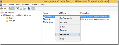
How to Enable the Built-in Administrator Account in Windows 8.1 (Historical)
Enable the built-in Windows 8.1 Administrator account only when necessary, set a strong password, and disable it again after troubleshooting.
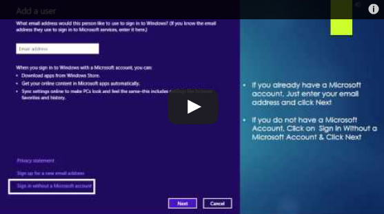
Set Up and Sync a Microsoft Account in Windows 8 (Historical)
Historical Windows 8 guide to adding a Microsoft account and enabling the operating system's original settings-sync experience across Windows 8 devices.